Introduction
This topic has always felt a bit futile to cover in a blog post form. Where it really belongs is likely a daily Youtube channel because that’s how fast AI is changing for both large language models (LLM) and text to image or text to video services. However, at some point we need to give principles on what works and doesn’t and do the best we can to keep this guide updated.
The Cake Debacle, A Personal Anecdote
Yesterday, my wife was a (harmless) victim of recent, pervasive laziness regarding AI generated images on the web. She set out to make a new cake that she eyed on Pinterest. The recipe showed a clear, detailed description of the end result, gave clear directions, and was accompanied by this image.

On this surface, this looks like a phenomenal cake and you think nothing of it. Until you start to dig into the description and directions.
My wife started to make the cake and was racking her brain to figure out where she went wrong when her cake looked nothing like the photo. This wasn’t even “Pinterest-fail” territory, it was an entirely different cake. The final product was this:
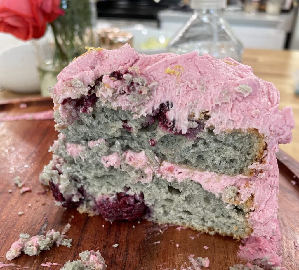
*Disclaimer – I got this photo after we had some friends over, and was lucky to get it because this cake was gone FAST. If my wife ever reads this, sorry I didn’t get the instagram-worthy photo version on here.
The point persists, this cake was not what was in the photo.
The Problem with AI Images for Web
The problem with using AI generated images for the web is NOT that they are inherently AI. It’s that the photo loses its entire purpose in enhancing the web experience.
- If the photo is different from the text it is describing, that’s a problem.
- If the photo raises our uncanny valley alarm bells, that’s a problem.
- If the photo is jarring to where we pause because of the odd nature of the photo itself, not the content, that’s a problem.
- If the photo is just plain wrong, that’s a problem.
I guarantee in my wife’s case, the creator of the recipe said something like “Great, now I don’t have to spend all that money and time on getting an actual photo. I’ll just put the recipe description into Midjourney, paste it in there, and call it a day.”
I’m all for doing things better-faster-cheaper. What I’m trying to warn against is using AI to cut corners as it can cheapen the user experience and your brand. Cut the corner, but don’t shred the paper on your way.
Why are Good Web Images Needed at All?
Let’s get something straight here: You need good imagery on your medical website.
Imagery, including graphics and treatments, sets the tone or emotion of the web page. The same sentence can be received two different ways depending on the imagery. Thus, choosing (or generating) the correct imagery matters for the overall quality of the browsing experience.
For the same sentence, the imagery could be conveying a message of:
- cheap vs premium
- warm vs cold
- relational vs transactional
- happy vs indifferent.
You should actively choose what the intended message to your user is with good imagery.
Example
Here’s an example of how a message can be different depending on the imagery and why good web images are needed. Below I have a standard 50/50 content component. The differences between the two are only the image, everything else is the same. The photo differences are subtle, but these two photos make you feel different ways. Which one would you prefer?

The real answer is you may actually prefer either one depending on the situation:
- In the top photo, the focus is on the patient. She seems happy, fun, enjoying her experience. It’s also clear she’s at the dentist.
- In contrast, the bottom option focuses on the provider. They are dressed the same, seem to be gentle, clean, and the background is pretty standard.
Both options work, but they portray different feelings. One might be used on a home page or landing page. The other might be used when explaining how a tooth extraction is going to work. The point is the image selection matters just as much as the words and other content.
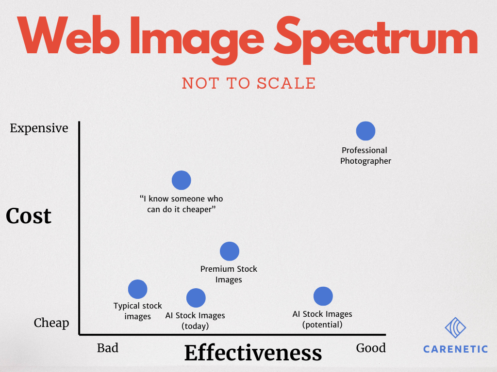
The Spectrum of Effectiveness of Image Choice on a Web Page
There’s a bit of a spectrum of pros and cons when it comes to choosing web images. The trade off seems to be in a cost versus effectiveness or quality metric.
Many businesses opt for professional photoshoots to create unique and valuable visual assets, which are updated every few years. On the other hand, some rely on stock photography, often humorously recognizing the same models appearing across numerous websites worldwide. Each approach offers distinct advantages and drawbacks
Some organizations opt for professional photoshoots to create unique and valuable visual assets, which are updated every few years. On the other hand, some rely on stock photography (I wonder if the same girl with braces that’s on 1000 other websites understands how many times her photo has been used). Each approach offers distinct advantages and drawbacks and a choice needs to be made.
Enter AI-generated imagery. When utilized effectively, AI can bridge the gap between the authenticity of custom photography and the affordability and convenience of stock images. High-quality AI images can rival the visual impact of real photos while significantly reducing both cost and production time. However, when implemented poorly, AI-generated images fail to enhance a website’s uniqueness, mirroring the redundancy of widely-used stock photos.
The graph below illustrates this trade off and the potential that AI generated web images promise. Personally, I’m not convinced we’re quite to that promise yet, but we’re moving that direction rather quickly.
Traits of Good Web Image Choice
When evaluating the quality of web images, several key traits ensure that they are effective in both design and functionality. The following is a list of those traits:
Pass/Fail Metrics
- High Resolution: Ensures that images are clear and detailed, even on high-definition displays. This is typically a pass/fail metric.
- Appropriate Sizing: Images should be optimized for quick loading without compromising quality. Think kilobytes (kb) not megabytes (mb).
- Accessibility: Text alternatives (alt text) should be provided for all images, ensuring accessibility for users with visual impairments. This actually helps more than just the visually impaired users.
- Legal Usage: Images should be either created by the website owner, purchased legitimately, or properly licensed to avoid copyright issues. Keep the lawyers out.
Qualitative Metrics
- Consistent Style:Images should match the website’s branding and tone, providing a consistent visual experience. If you have to pause and wonder why something is there, you’ve done it wrong. This includes wondering if its an AI generated image.
- Effective Composition: Important subjects should be well-framed and prominent, supporting the site’s content hierarchy. It should be clear who the focus is on.
- Relevance: Images must be contextually appropriate for the content they accompany, enhancing the message rather than detracting from it. Show and tell.
Good and Bad Examples of AI use on medical websites
In the next several sections, I will analyze what I think about the use of AI web images on several site examples. See if you agree with my assessment or not.
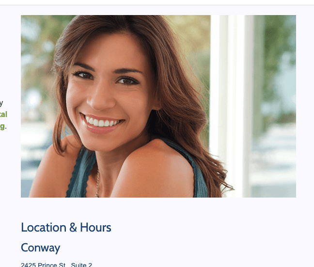
General Dentist – Location Page
In this case on a general dentist site there’s two problems.
- Consistent Style: The site’s images were fine but suddenly, this image was TOO good. My uncanny valley alarm bells go off. Perfect skin, teeth, hair and if you look closer at the clothing you start to realize this is an AI image.
- Relevance: The page structure is not great and it’s an odd time to put a photo on the right side of a location page. The user is there to get location details, they don’t need another smiling person.
In most other parts of the site, I wouldn’t have cared that this was AI – but it was out of place and too perfect which caught my attention. And catching my attention for an image is not what we want on a location page.
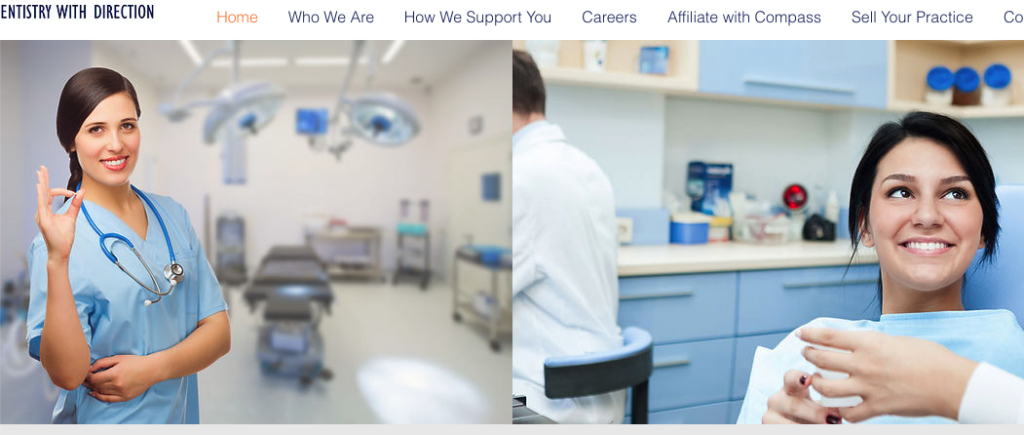
DSO Parent Company – Homepage
This is a DSO parent company website homepage but if we evaluate it against the traits above, we see some issues.
- Consistent Style: This is very much a low effort image slapped onto an operating room. This seems to be doing more harm than good in my opinion. Especially paired with (what appears to be) a real image on the right, it stands out even more. It’s the first think I look at on the page and I’m distracted by how unnatural it looks that
- Effective Composition: As I stated above, this is a DSO parent site. It doesn’t make a ton of sense to show a cheesy operating room photo and a photo of a patient. The point of the site is to “sell” the doctor on your organization. Because these two are side by side, its not clear who I should focus on and why they’re there.
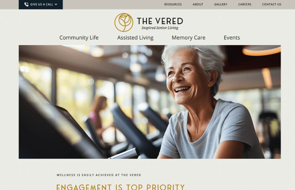
Senior Living – Homepage
This is one that you’d need to be gutsy/risky to do but I wouldn’t fault someone for placing this image. When analyzing against our traits above:
- Relevance: It gets the point across but a full width hero image is likely not the best use of AI right now. It’s too big and in your face and invites scrutiny. This one is fairly well done but the foreground elements raise alarm bells in your head for not being real and distract from the purpose of the site.
- Consistent Style: However, the woman is generated well and matches the intent and emotion of the site. I will give them a good rating on this.
Bonus Example – Big 4 Accounting – Services Page
This is admittedly not a medical website but I loved this example so much that I threw it in. This is actually EY’s website. The point here is it doesn’t matter how big and established you are, don’t cut corners and do more harm than good. (hint, take a look at their screen and keyboard)

Assisted Living Site – General Services Page
The keen eye will notice that this is an AI image but I’m ok with that as the user.
- Relevance: First off, the photo makes sense for the content.
- Effective Composition: Second, it’s a photo that could actually exist. The woman appears to be the right age, the background supports her activity, and she doesn’t look too perfect. If I’m shopping on this site for senior living services, I’m not bothered by this (and likely don’t even notice). Only reason I knew this was there is because while we didn’t provide the image, we built this site.
- Consistent Style: This photo matches the style of the rest of the site (including the homepage example above) and so its not jarring to me that it’s here. Everything else looks like this, including the real images they used. They blended real and AI very well in this case.
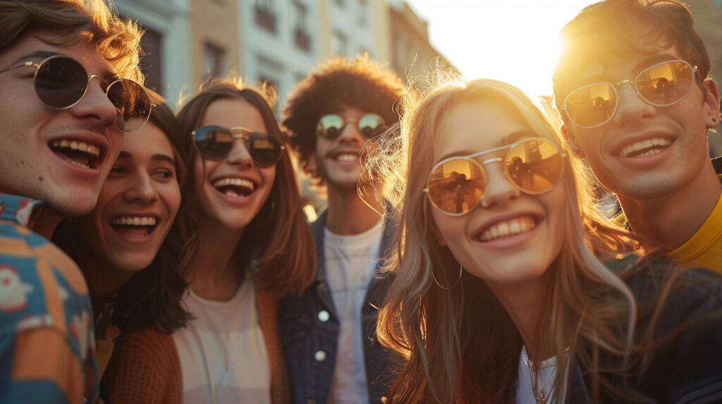
Behavioral Health Website – Service Page
Getting candid photos is really tough. In this case, I think AI was used well to create the feel-good emotion of a candid youth photo.
- Consistent Style: This matched the vibe of the website and was used in a small 50/50 component so it didn’t distract from the overall message of finding some hope in their services.
- Effective Composition: Sunglasses reflection is risky here to make you stop and look but this photo was small enough that it didn’t matter.
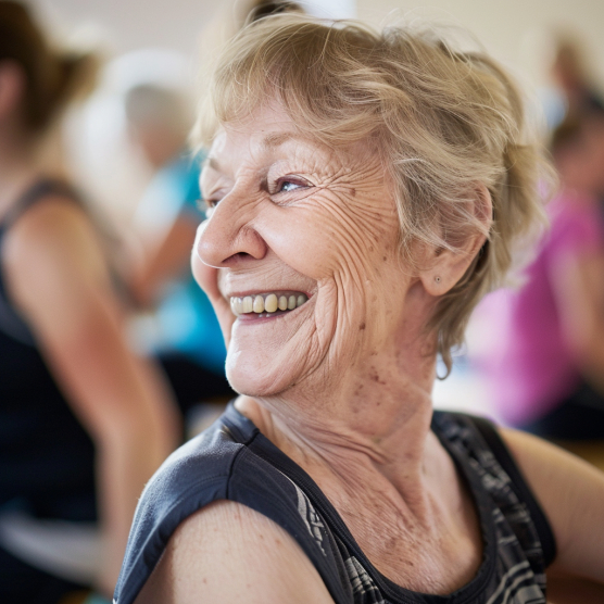
Senior Living – Services Page
This is another senior living because this is a site we did in recent memory.
- Effective Composition: I like that her teeth aren’t perfect and her skin matches the age demographic of the typical user we’re expecting. In other words, this feels very real and relatable even though this person doesn’t exist.
- Relevance: This was used on a service page for group fitness classes. Closeups can be risky as there’s more room for error and inspection but this was used in a small way halfway down the page and is largely unnoticed while enhancing the page.
Conclusion
Navigating the evolving landscape of AI-generated imagery in web design, especially within the healthcare sector, requires a discerning eye and a commitment to authenticity. As we’ve explored, the integration of AI images can get hairy real quick. It’s not about the technology’s capability to create; it’s about our responsibility to use it in the correct context and setting.
Let’s commit to using AI not as simply a shortcut, but as a tool that enhances the user experience.